Project Name
Metro Bank
Category
UX/UI Design
Fintech
Overview
This case study looks at improving the user experience when applying for a business account with Metro Bank. I have undertaken the task of reviewing the business account application process for Metro Bank and sought to improve the user experience by creating an online application process.
The Why
Metro Bank faces a decline in popularity with SME business owners over the next few years in the U.K. due to increased competition from challenger banks (Monzo, starling, Revolut) that provides an online business account application process which is coupled with a memorable experience. If Metro Bank can match or provide a better experience for SME's, they could retain their popularity and increase their customer base.
Design Goals
The goal of this case study is to produce an online application process for Metro Bank that can provide their users with a simple process from having no business bank account with them to having one in a set amount of steps at the users convenience.
Design Process
To start this project I implemented the User-Centred Design (UCD) process. I used the process found on Think with Google.

Research - User
To get an empathetic point of view of how my potential user would interact with the process I design, I decided to understand how users currently feel about the banks they use and application processes they've completed.
Research - Market
After conducting my primary research with users, I then went on to see what was actually happening in the market and what the competitors of Metro Bank were doing. I also looked into application form best practices, UX laws and what users wanted in an application form:
https://builtformars.co.uk/banks/opening/ - an analysis of the experience opening an account with both traditional and challenger banks.
Key Findings:
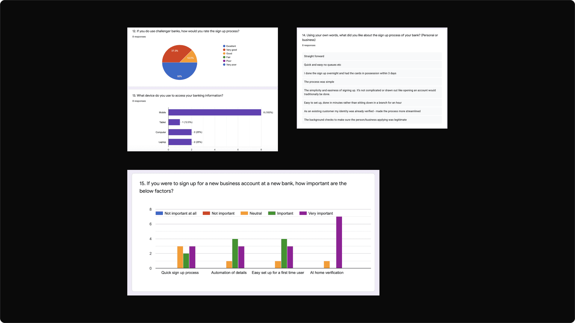
Number of clicks it takes to open an account is essential, an upper hand challenger banks have as they are based mainly online.
The delivery of the physical card matters and the ability to use your card (Apple pay, Google pay etc) on your device before the physical copy arrives matters as it provides a sense of completion.
The challenger banks were significantly quicker (in days) and required less effort (in clicks) to get an active account.
Challenger banks asked fewer questions to the user in the application form and when it came to asking about address information, they only required 1 address.
The time it takes to make a decision increases with the number and complexity of choices.
Simplify choices for the user by breaking down complex tasks into smaller steps.
Avoid overwhelming users by highlighting recommended options.
Use progressive onboarding to minimise cognitive load for new users.
Frustration is a powerful driver to abandon any activity, no matter how much you might want to complete it.
An experience from an individual opening a business banking account with Metro Bank, Starling, Revolut and Tide.
Key findings:
According to this article, Revolut comes in 1st place for meeting small businesses needs and Metro Bank came in 2nd place for small businesses.
Opening an account with Metro bank was tedious to say the least according to this source.
This article shows how a user might feel, think and interact with Metro Bank, Revolut, Starling or Tide when opening an account with them.
Metro bank has physical presence due to having bank branches (this works in the older demographic audience) but the online experience isn’t as strong as challengers (this works against the younger demographic audience).
Findings & Solutions
Earlier in this case study I reported of an individuals experience opening a business account with Metro Bank and the process was tedious and frustrating. This was mainly due to the fact that they have no online process, with an online process, they save users time, energy and unnecessary frutstration.
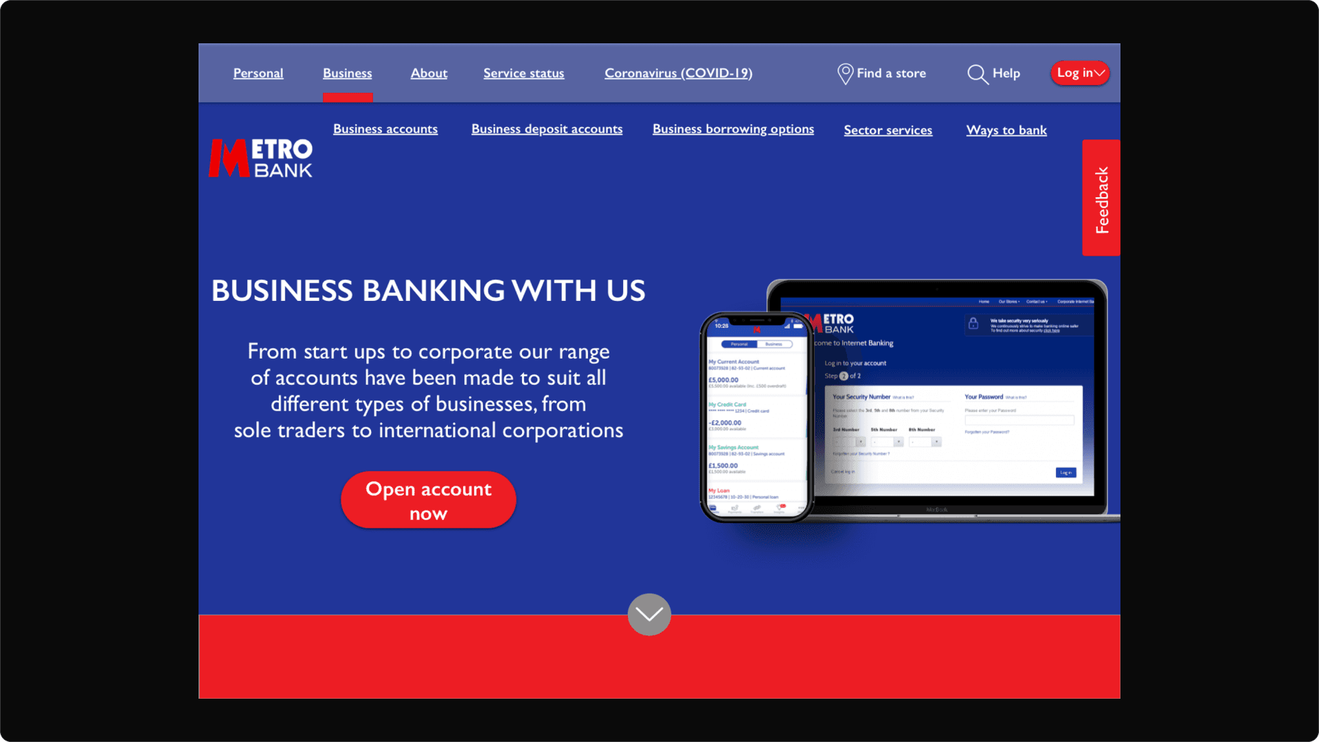
Metro Bank is very popular with SME's in the U.K., and they're voted best business bank based on online and mobile banking services, they have no online application process and for a bank that claims that it wants to be the bank of the future, this can prove contradictory and or detrimental. To address this, an online application is a start (already mentioned) and touches to the UX and UI on the website (getting rid of burger bar menu).
Many users are very time conscious and want to get through something, not so easy that it feels like a scam, but easy enough to provide them with a sense of ease and completion.
The simple and straightforward design of the application process, which saves the user a trip to a physical branch but allows them to get the same help and assistance as if they were in the branch, solves the time conscious pain point users face.
Designs, Wireframes & Branding


Takeaways
What I would do differently is set aside more time to gather primary research. I think if i had a much bigger pool of people to study I would have been able to find pain point trends and potentially adjust my UX designs better.
What I really enjoyed about this process was the excitement of it. I've really learned so much more about the financial services, challenger banks and traditional banks and how application processes can really retain or reject a user to interacting with your product, service or business.
In the world of Fintech, the business who provides customers with the most value and convenient service will be the businesses who thrive and continue to grow and develop - putting people over profits will soon, if not already now, be an essential to winning in this industry
This will hide itself!