Project Name
Nationwide
Category
UX/UI Design
Fintech

Overview
The Nationwide Online Banking app is an app for Nationwide customers which allows them to access their bank statements, details, pay bills and people. The app allows customers to bank conveniently from wherever they are while using their smartphone.
The Why
Being able to bank comfortably from your smartphone is becoming a pertinent part of our society and also a very relevant part of the banking and financial world.
Nationwide positioned themselves to be relevant and competitive by keeping up with their competition and entering into the digital banking world.
But there still remains one problem with Nationwide and their online banking app:
"Nationwide do not allow their users to pay new payee's without the need for a physical card reader. Considering their competition's UX in regards to paying a payee is simple, this presents Nationwide with a challenge business and customer wise"
In simpler terms - Nationwide need to make their app more convenient for users to use in this day and age.
Hypothesis
If Nationwide can provide their customers with an in app user experience which allows users to complete tasks at their convenience, they could remain competitive to their competition and retain customers who will be more loyal to them.
Design Process

I discovered with the Nationwide app that there were a series of problems. I then defined the main problem that could effect business and customers, so I focused in on this problem. I then developed a solution this problem and then delivered it to users of the app to get their feedback.
Design Goals
For this case study the main goal was improving the convenience for a user when needing to pay someone. The app needed a much more human-centred design approach.
After speaking to users who have the Nationwide app and reading through reviews on the App Store I identified a main problem with the app
Still having to use a card reader to transfer money to a new payee
Is this worth solving
This problem is worth solving as it can improve the UX that customers of Nationwide engage in when banking online with them. Statistics show that mobile/digital banking is the future for banks with many people using their banks from the convenience of their phone. This means Nationwide should tackle any UX problems that could leave them in the past as their competition moves on.
I don't have the full data to show why this is a problem worth solving but a few statistics about mobile banking will help prove why making sure a banks mobile app UX is strong is imperative:
By the end 2021, 38% of Brits either will have or intend to have a digital only bank – equal to almost 20 million Brits.
Two-thirds of banking customers say they plan to convert fully to a digital bank in the future.
Source: https://www.finder.com/uk/digital-banking-statistics
Research - User
Key findings from User interviews:
I interviewed 3 users regarding their mobile banking and found 3 key findings that I took into consideration:
Being able to see live payments and transactions is key
The ability to make easy simple payments - in regard to the card reader, they have a very negative effect on users
Banks making sure their app is easy to use and up to date with the competition matters to users
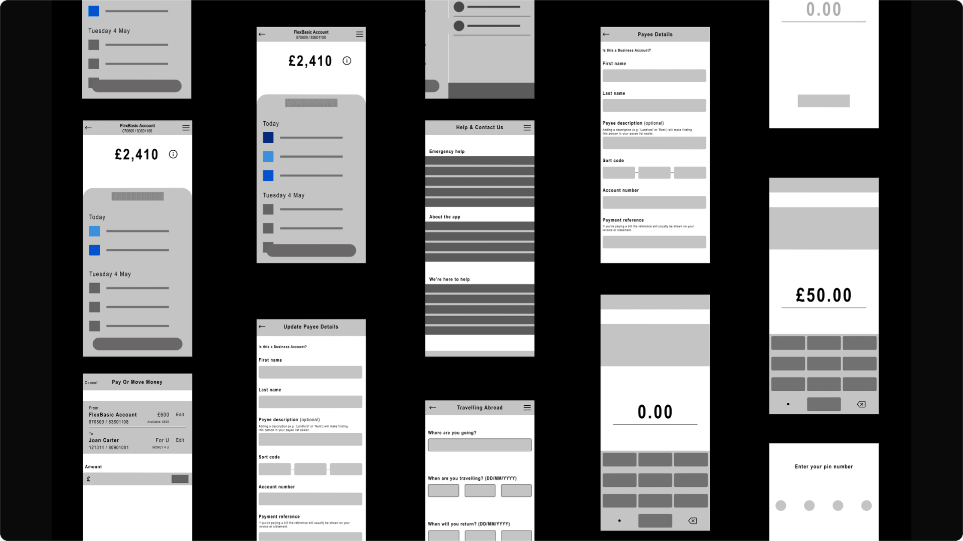
Here are a few screenshots I used as secondary research for my case study:
Research - Market
Alongside conducting secondary user research, I also conducted market research of a competitors to Nationwide I reviewed what making payments was like on their apps and how convenient it is for users to use the app

Findings & Solutions
After interviewing users who have the Nationwide banking app and reading through reviews published by users on the App Store I identified one main problem with the app, that users wanted to be solved. Ultimately these problems revolved around human convenience and being able to carry out tasks without 'pointless' digital friction.
The Problem:
Still having to use a card reader to transfer money to a new payee - this results in a negative user experience and has a detrimental effect on the ease of use.
Wireframes, Branding, Designs & Prototypes
After my research was conducted and I was satisfied with my solutions to users' problems I began sketching, studying Nationwide's UI and wireframing:
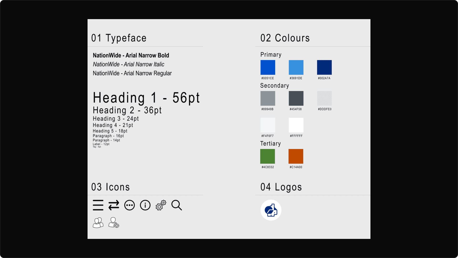
The UI style guide I created for this case study, the aim was to keep the UI as similar to Nationwide's as possible:
The current user journey Nationwide customers must take to pay someone new - there are 10 steps a user must take to pay someone new, as well as needing a card reader - this can be cut down and made simpler.
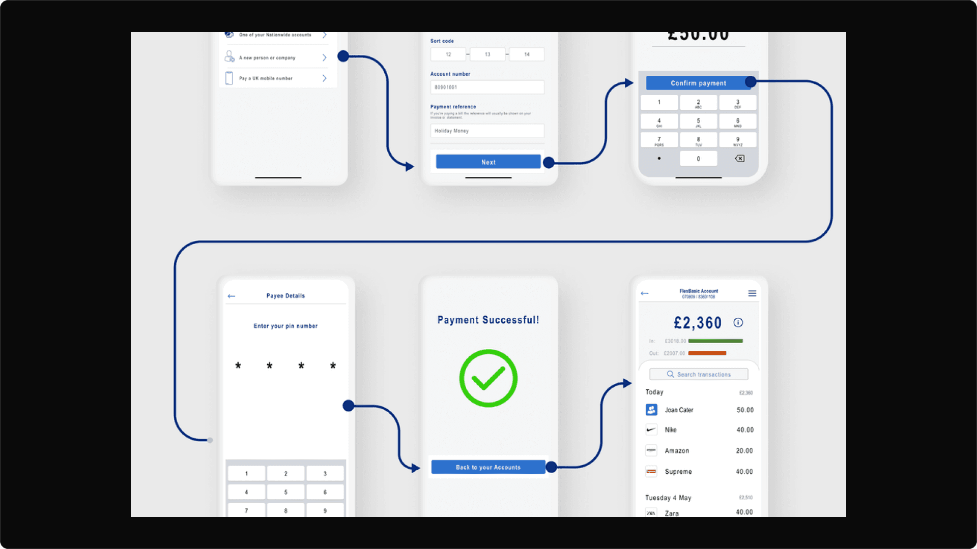
Paying someone new user journey I developed. This user journey would present users with 3 less steps and no need for a card reader. The process would allow users to pay someone new quicker and easier.
How users get from 'pay or move money’ to 'paying someone new':
Users tap the 'menu' icon then tap 'payments and transfers' or they can tap 'pay or move money' on their account home page
The user then selects who they are paying e.g. 'someone you've paid before' or 'a new person or company'
The user then enters the details necessary for the transfer (account number, sort code, name etc)
Then the amount to be transferred is entered
The user then enters their card's PIN number
The new person or company they intended to pay will then receive the payment instantly or within a few minutes


Takeaways
Human centred design is key when designing apps which involve money, finance and frequent use - always make sure the nuances of human life and lifestyle are considered when designing apps which are essential to everyday living
Perfection isn't the goal, optimising what you have and creating convenience for the user is - nothing is perfect and imperfect humans can never create perfect solutions, we can make convenient ones though!
In this case study I identified four problems with the Nationwide app but then to define and focus on solving one problem effectively I pin pointed one
I use the Nationwide banking app and Monzo. Monzo is generally my first choice when banking online due to its ease of use. Nationwide should implement UX best practices to make sure they are first option for banking with their customers
As a designer the main takeaway I have taken from this project is learning how to focus in on one problem and really explore it. This helped me to solve a problem effectively and develop a solution which I think will provide value and have a positive effect on user
This will hide itself!