Project Name
Ocean Finance
Category
UX/UI Design
Fintech
Overview
Ocean Finance is a loans and mortgages company formed in the U.K. In this case study I set out to improve the form design of their 'Secured Loans' form. Ocean Finance generate a large amount of revenue from loans, ensuring they have a form that provides a user with a simple and easy process to apply for one is essential.
The Why
Loans are a huge part of Ocean Finance as a brand and as a business. This means that the forms they design for their loans must provide a smooth and easy experience that is able to lead users to their goal in a simple but effective way. This can be done buy applying UX principles to their current form.
Hypothesis
If Ocean Finance can improve the UX of their secured loans form, they may be able to increase their revenue, provide more people with loans and gain loyal customers who engage with other products they have on offer.
Is this worth problem worth solving?
I believe this problem is worth solving for Ocean Finance as it effects their revenue and their brand as a business. They are a loans and mortgage company so, essentially they make money by lending out money to their customers. Their online form, to see if a user is eligible for a loan or wants a quote for a loan, needs to be simple, easy to use and take the user from A to B in an efficient way.
To ensure they remain competitive and generate more revenue - Ocean Finance improving the UX of their secured loans form is imperative.
Design Goals
The goals for the design in this case study was to apply UX best practices and principles to the form to improve the user experience and keep Ocean Finance competitive in their industry.
A. few goals/solutions I had for the form are listed below:
Make the process for getting a loan as simple as possible
Shorten the amount of questions asked so that only the essential questions are asked
Inclusive design (E.g. A user's title)
Single page structure where user can scroll down the page
Research - Best practices
I researched UX best practices for form design and then from my research analysed the current Ocean Finance form and discovered what needed adjustment:
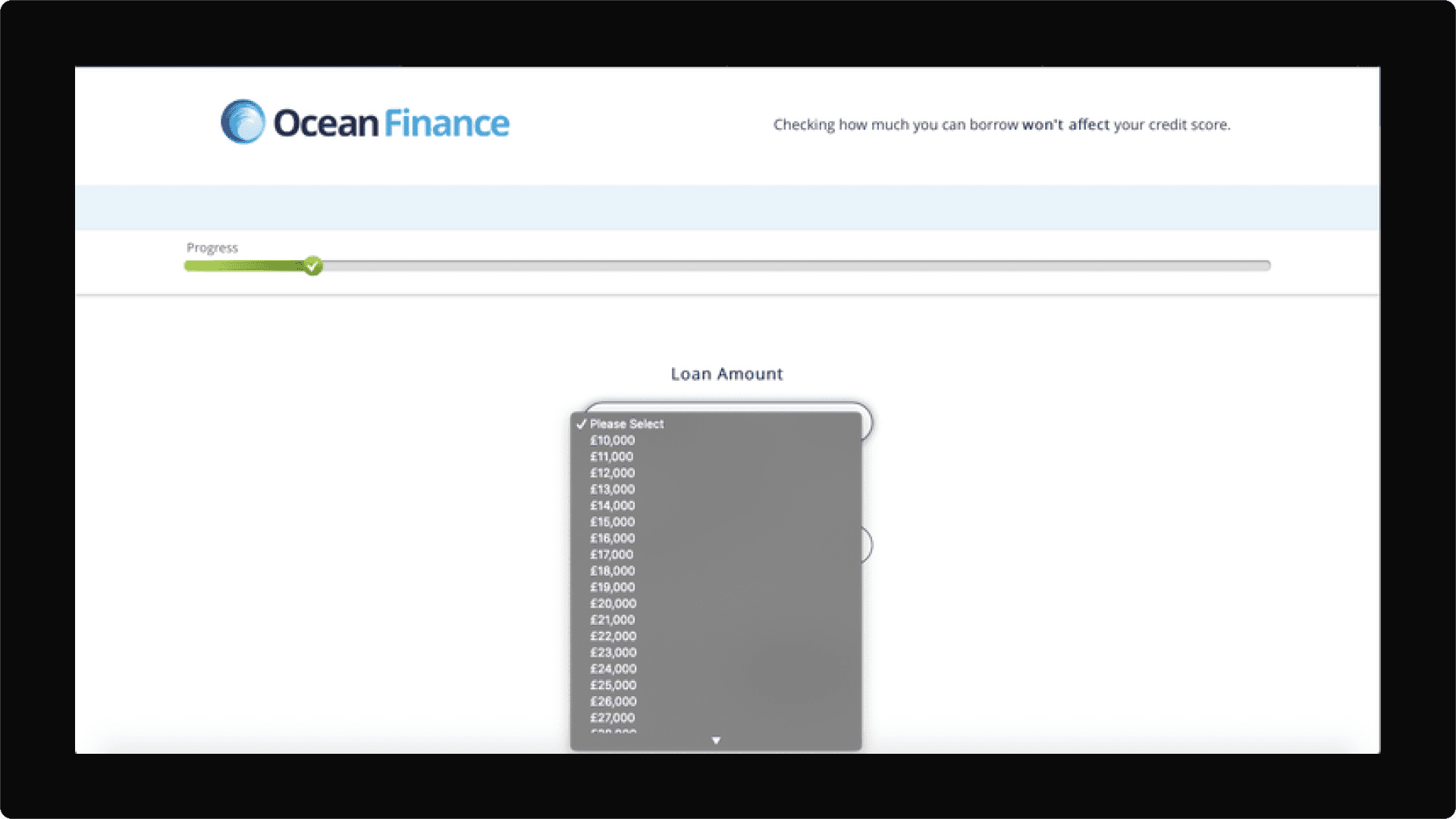
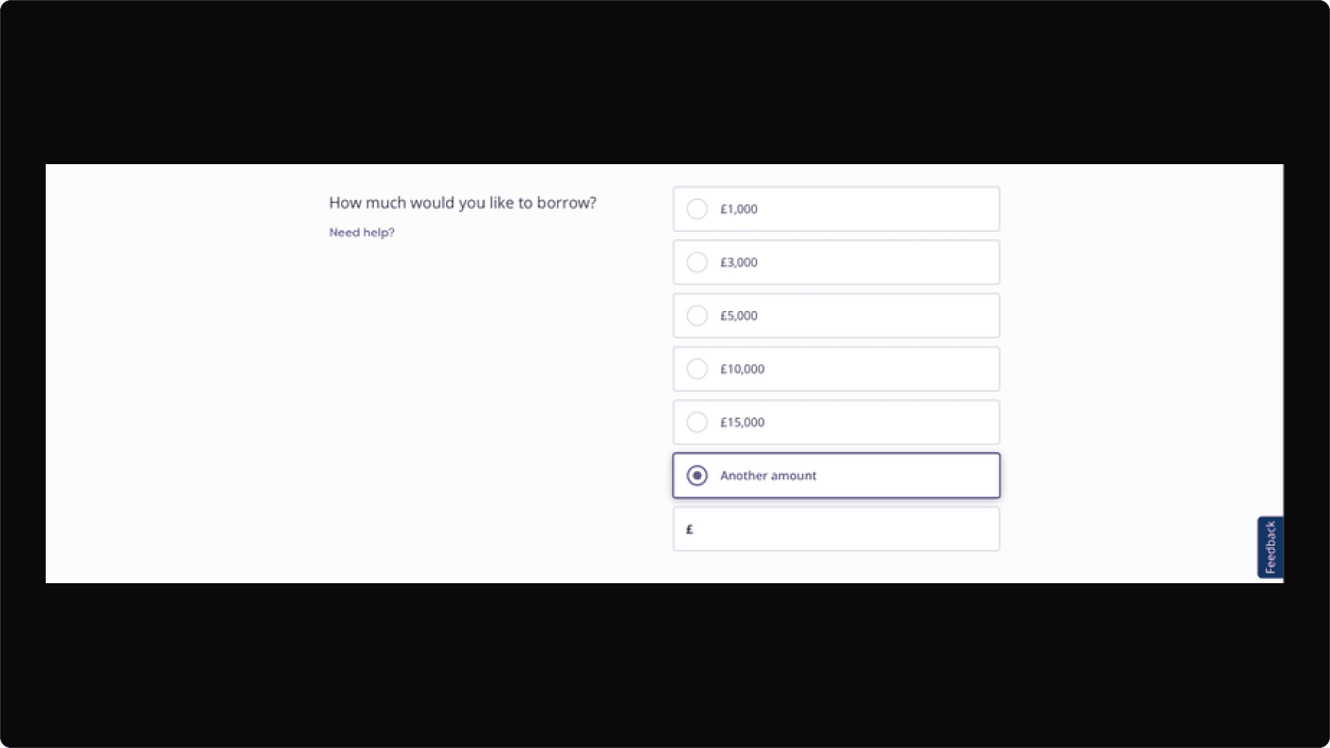
This drop down menu is overwhelming and provides too much choice (cognitive overload)
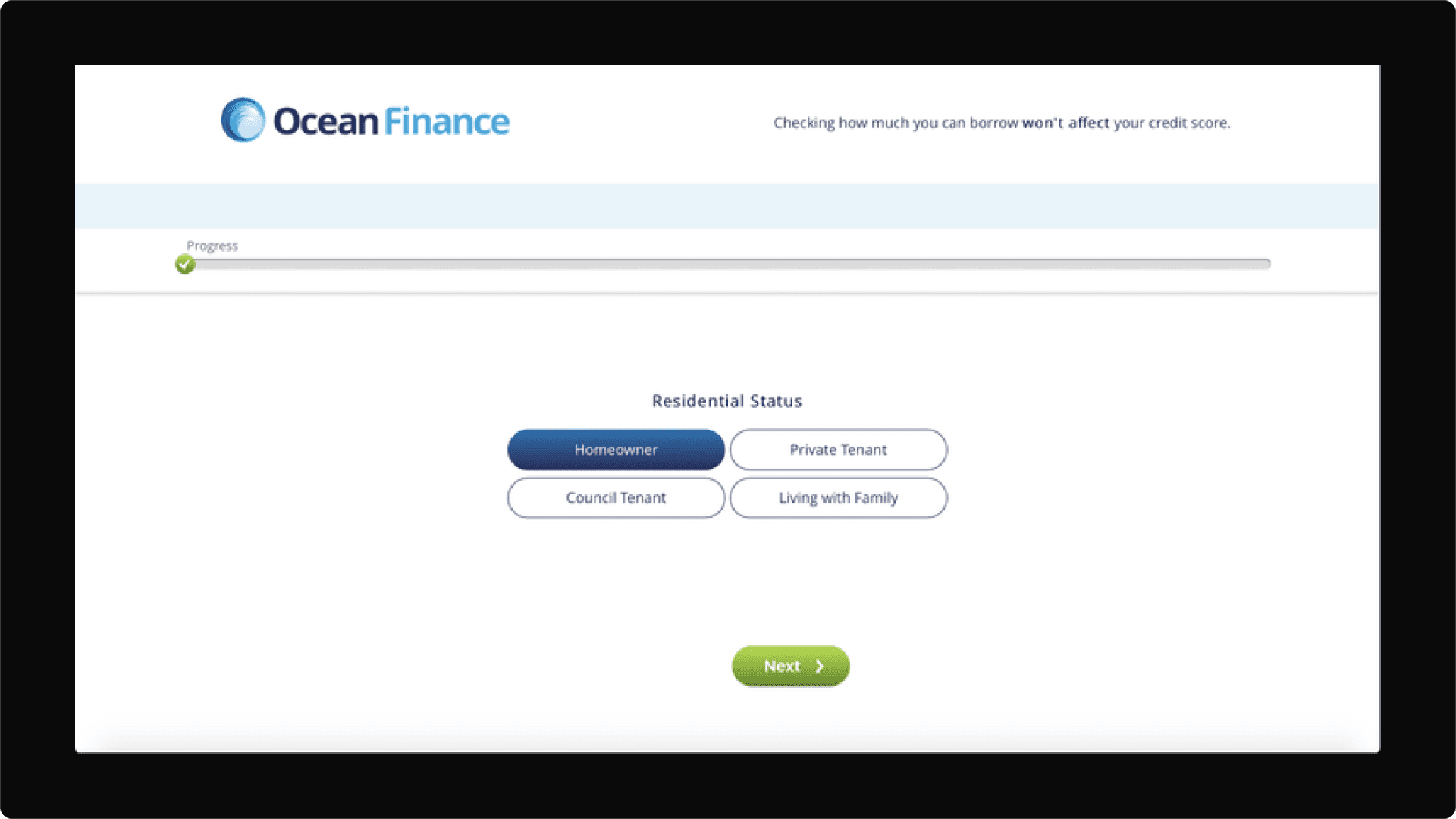
The progress-o-meter near the top of the page fails to indicate to a user how long this form will be or how much progress has been made

The options for title may be deemed as not inclusive of all types of users
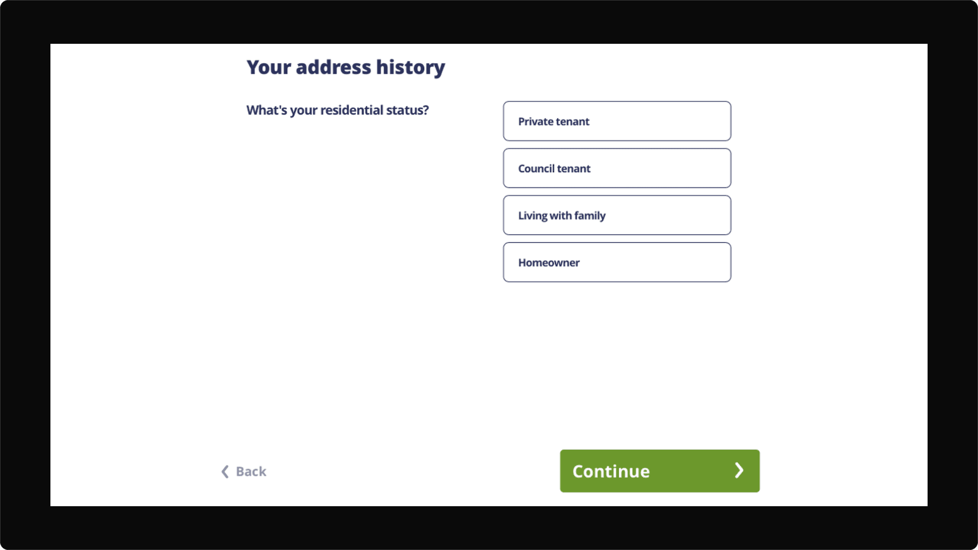
A user is asked twice about their residence, this question appears at the start of the form when really it should come a bit later in the form
Research - Market
I conducted research on Ocean Finance's main competitor - Money Super Market and also researched, Compare The Market, Admiral and Aspire Money. I looked into the design and functionality of the loan forms they had on their websites.

I aimed to see how their loan form may compete with Ocean Finances - and what best practices, if any, they have incorporated into their design, below are my findings:
Money Super Market
Money Supermarket have set indicated amounts users can borrow, they also have a section where users can enter the amount they want - beats scrolling endlessly through a dropdown menu...

Money Supermarket also ask simple questions first - this helps to engage users and ready them for the more specific questions later

Money Supermarket also have a single page vertical form layout, this helps users gauge how long the form could take and takes away the 'clicking-through-pages' digital friction.
Admiral
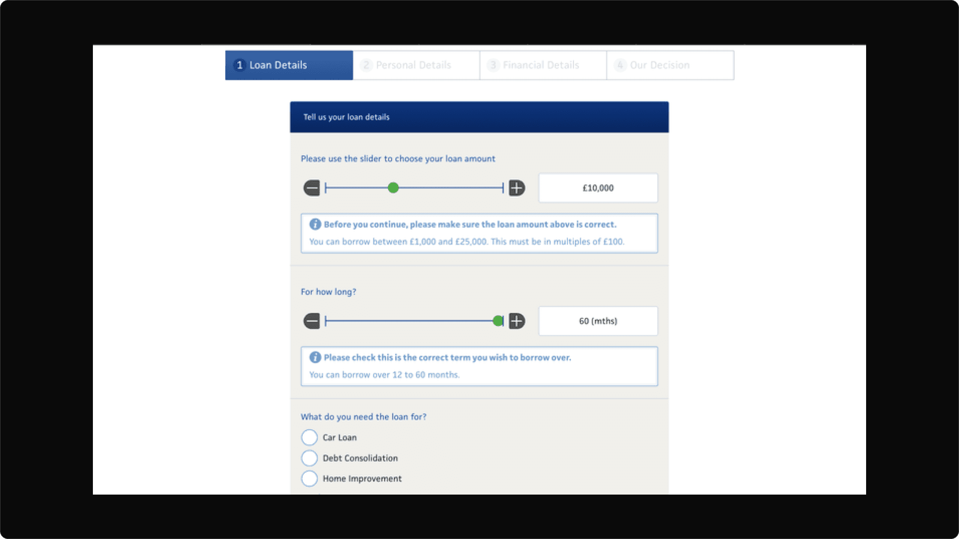
The slider can cause usability problems for a user - it could be better to provide a data field where users can input the amount they want
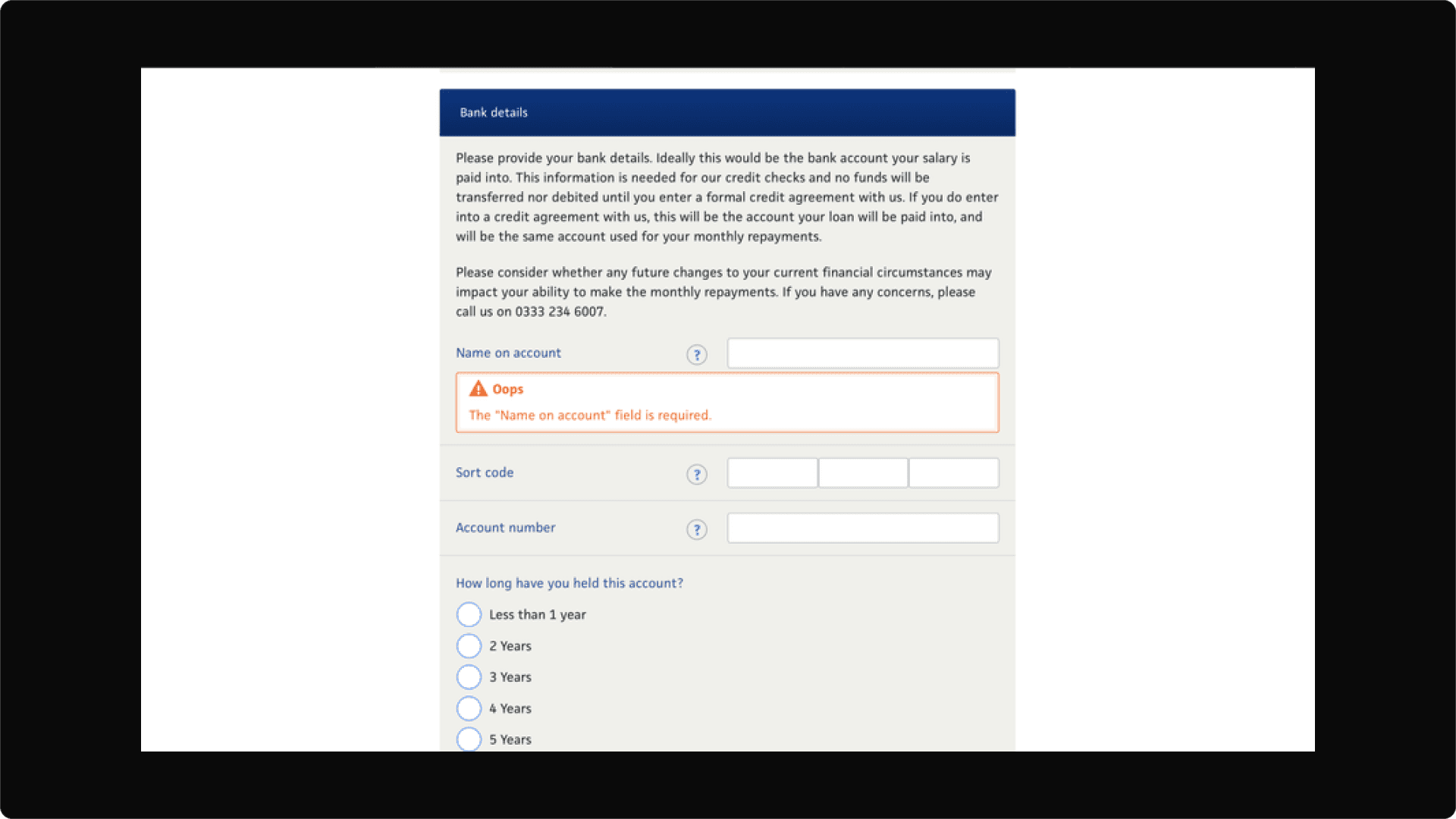
Bank Details - could this have something to do with budget? Compare the Market and Money Super Market don't require your bank details but Ocean finance, Admiral and Aspire require your bank details.
Aspire Money

A drop down menu is presented as the first step and it has over 16 options - this can produce cognitive overload in users and can damage the UX.
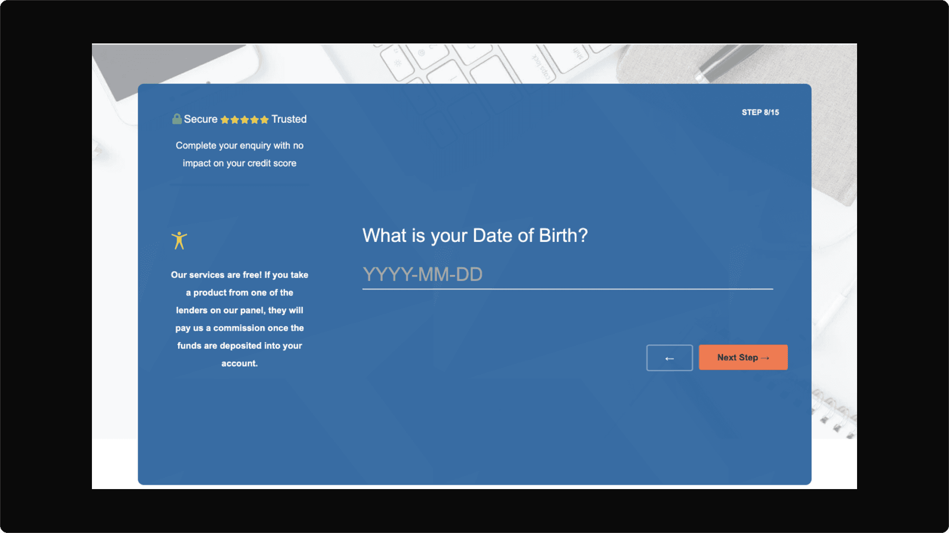
Whats good about this form is that there is an indicator as to how many steps it will take to complete the form in the top right corner
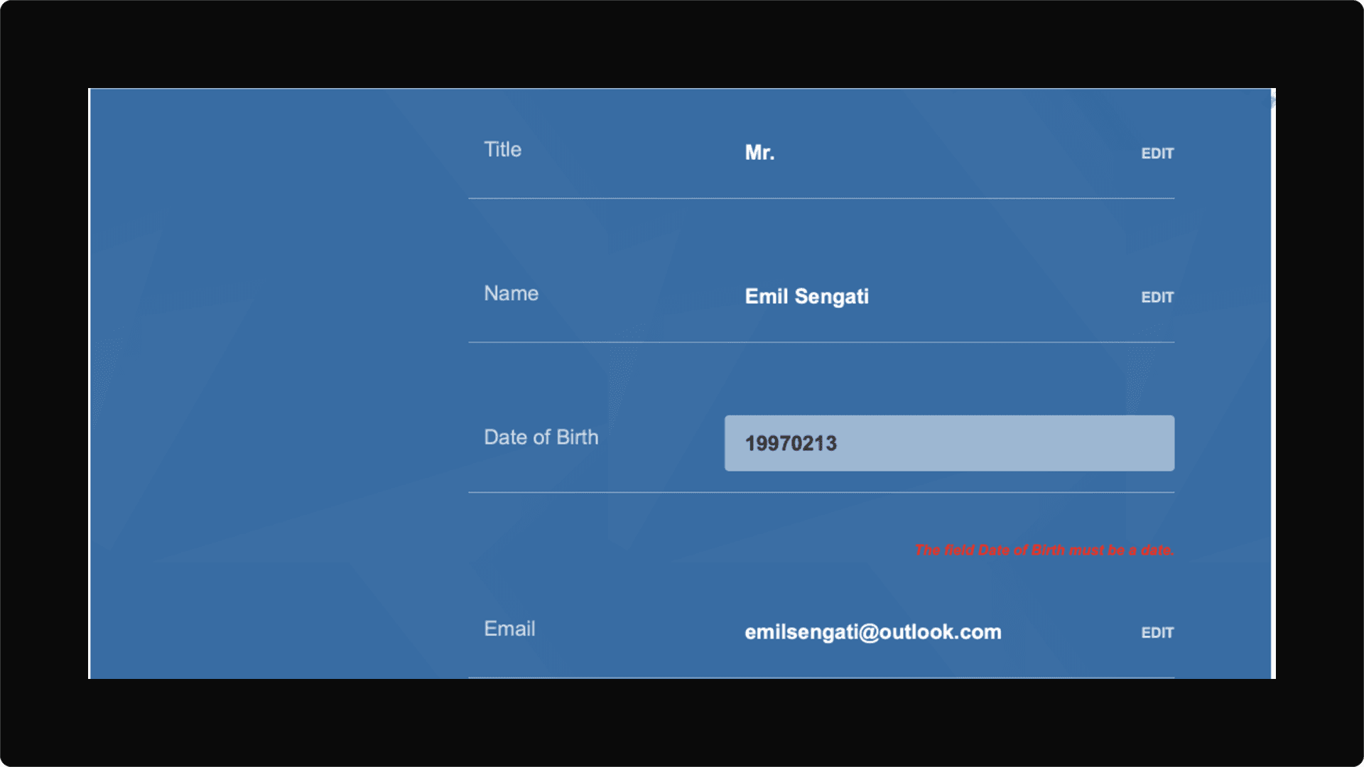
The error message is harsh on the users' eyes and should be designed in a different colour. In an image posted above this one the date format is YYYY-MM-DD which is not usual for UK companies and can cause confusion. On top of that when I entered the date how they wanted I had an error message appear. I then realised the dashes '-' were needed. Annoying.
Compare The Market
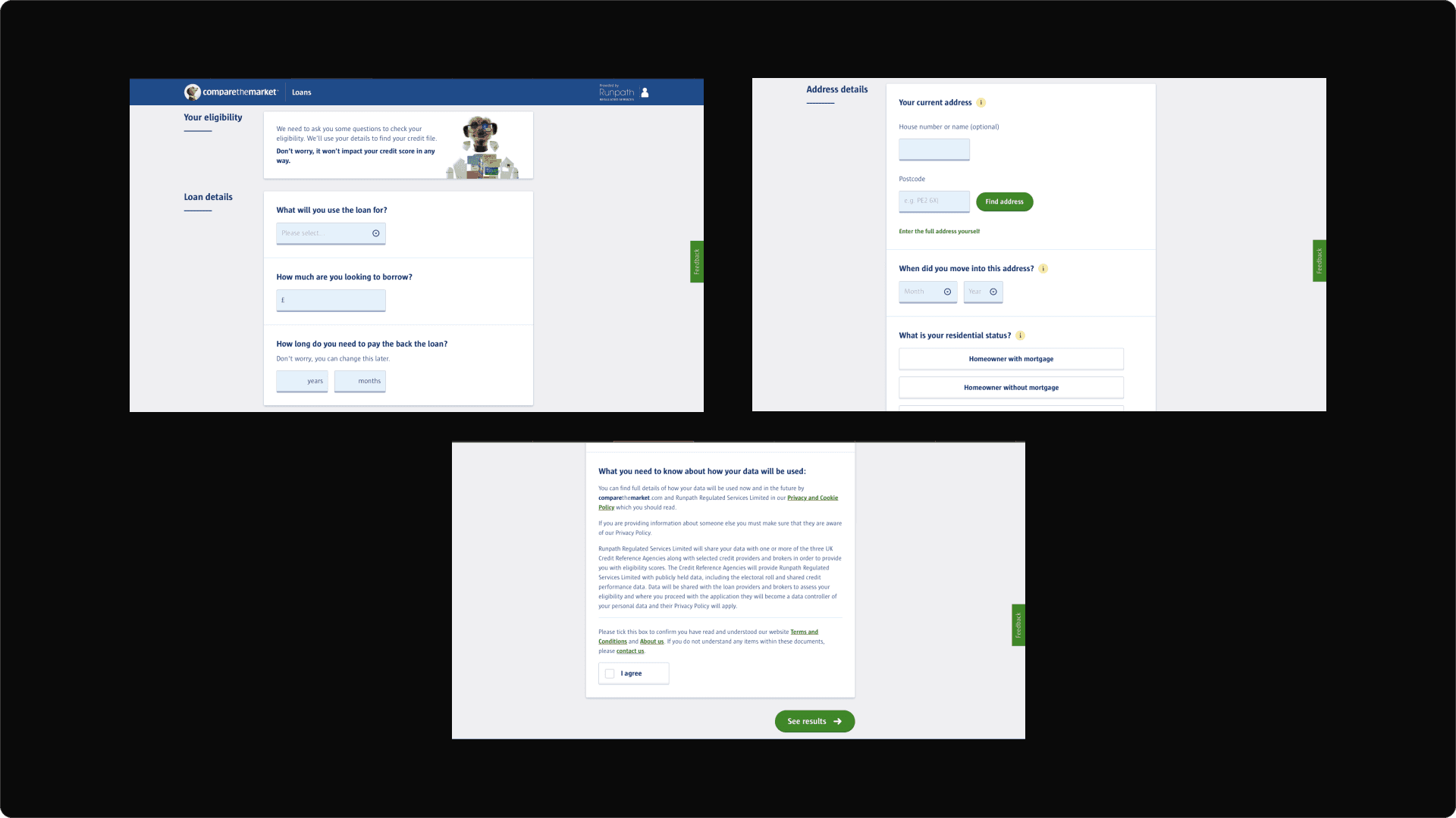
Compare the market have the best form out of the competition in my opinion.
It is a single page so users can scroll to see the length it could potentially take to complete the form. Their form also focuses on the key information a user needs to provide.
Their form has 4 sections, clean titles and data fields and one main call to action button that is at the bottom of the page. The experience I had completing this form was very quick, clean and simple. There was rarely any friction in the process and it allowed me to reach the goal of the form efficiently.
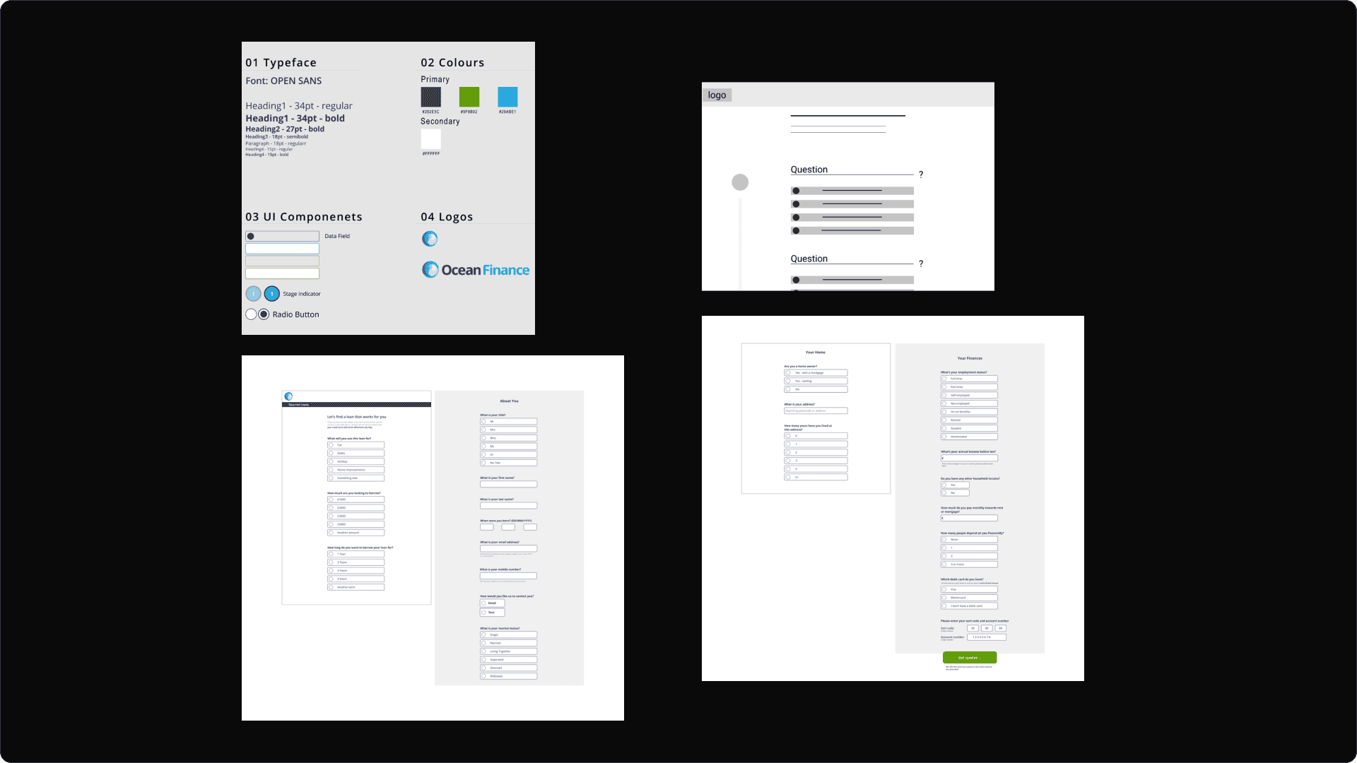
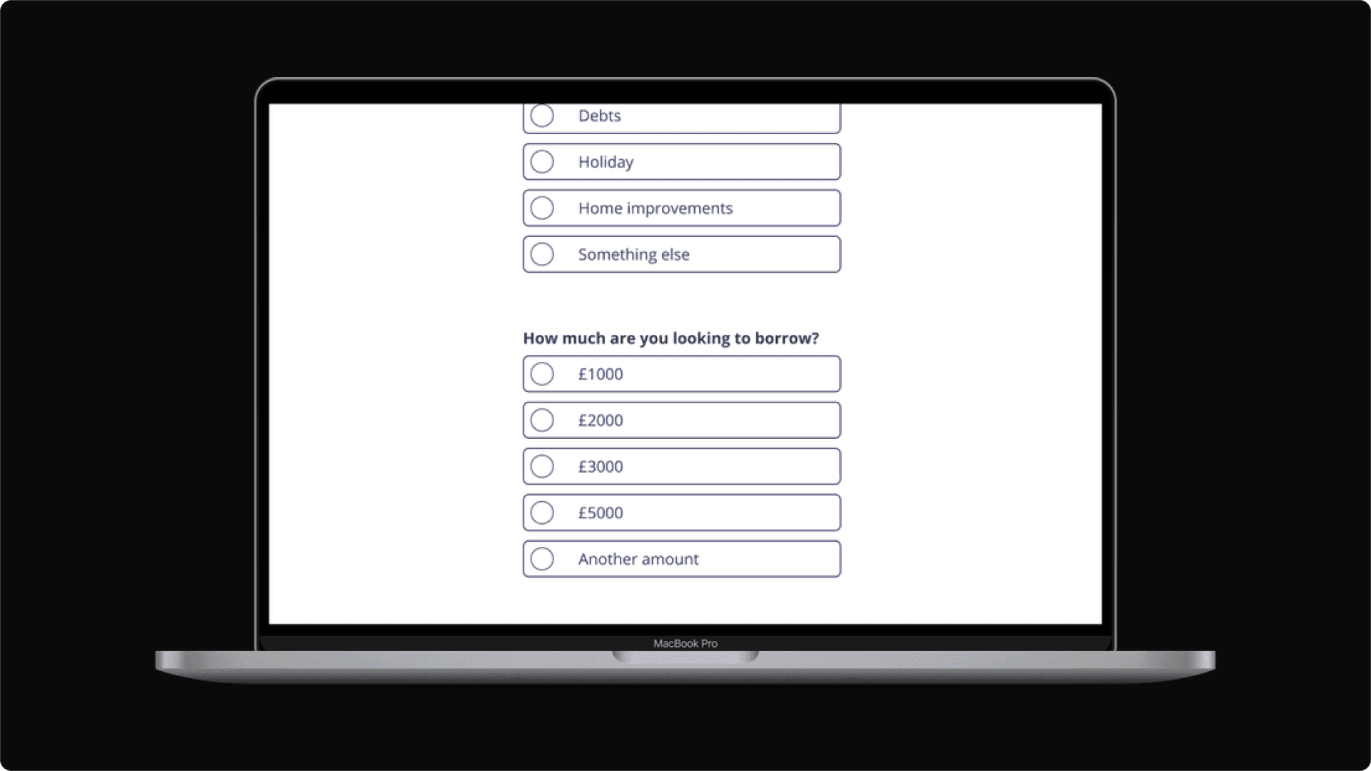
Designs, Wireframes, Prototypes & Branding
After conducting my research and competitor analysis, I moved onto the design stage producing low, mid and high-fidelity wireframes. The UI style guide I used was in line with the Ocean Finance UI style as this case study was focused on improving the UX rather than the UI.


Takeaways
Key lessons I learned during the process of redesigning Ocean Finance's secured loans form were:
When designing a form always consider what the users' main goal is - ultimately what do they want to get from this form
KISS - keep it simple stupid. Lots of clicks, lots of scrolling, numerous amounts of choices are Michael Jackson BAD for form design
Always leave room for improvement - meet your users' needs, but always consider ways in which your design can be improved and strengthened
Given the opportunity I would consider doing some testing with my form vs the Ocean Finance form with users, this would be to see how I could improve the design and meet users' needs in a better way - I can't always get it right!
For this form to be even more effective and on the level of Comapre The Market - fewer questions need to be asked of the user. Main core questions that will provide a credit check and give the company personal information only is vital
This will hide itself!