Project Name
Verizon Fire TV
Category
UX Design
Media / Entertainment
Overview
Our client Verizon has a product called Fios TV, which we updated and is now a product called Fios Customer Launcher (FCL). Fios TV is also accessible on Amazon’s Fire TV and Apple TV. This is so that Verizon can reach a wider audience and tap into other products and benefit from their audiences/customers as well.
When FCL received an update (also conducted by the design studio I work for) updating the core product was also necessary (Fire TV & TV-OS). I was tasked with aligning the consumption view of the product to the updated FCL UI. I also had to make sure the Fire TV and Apple TV-OS UI were implemented in this change.
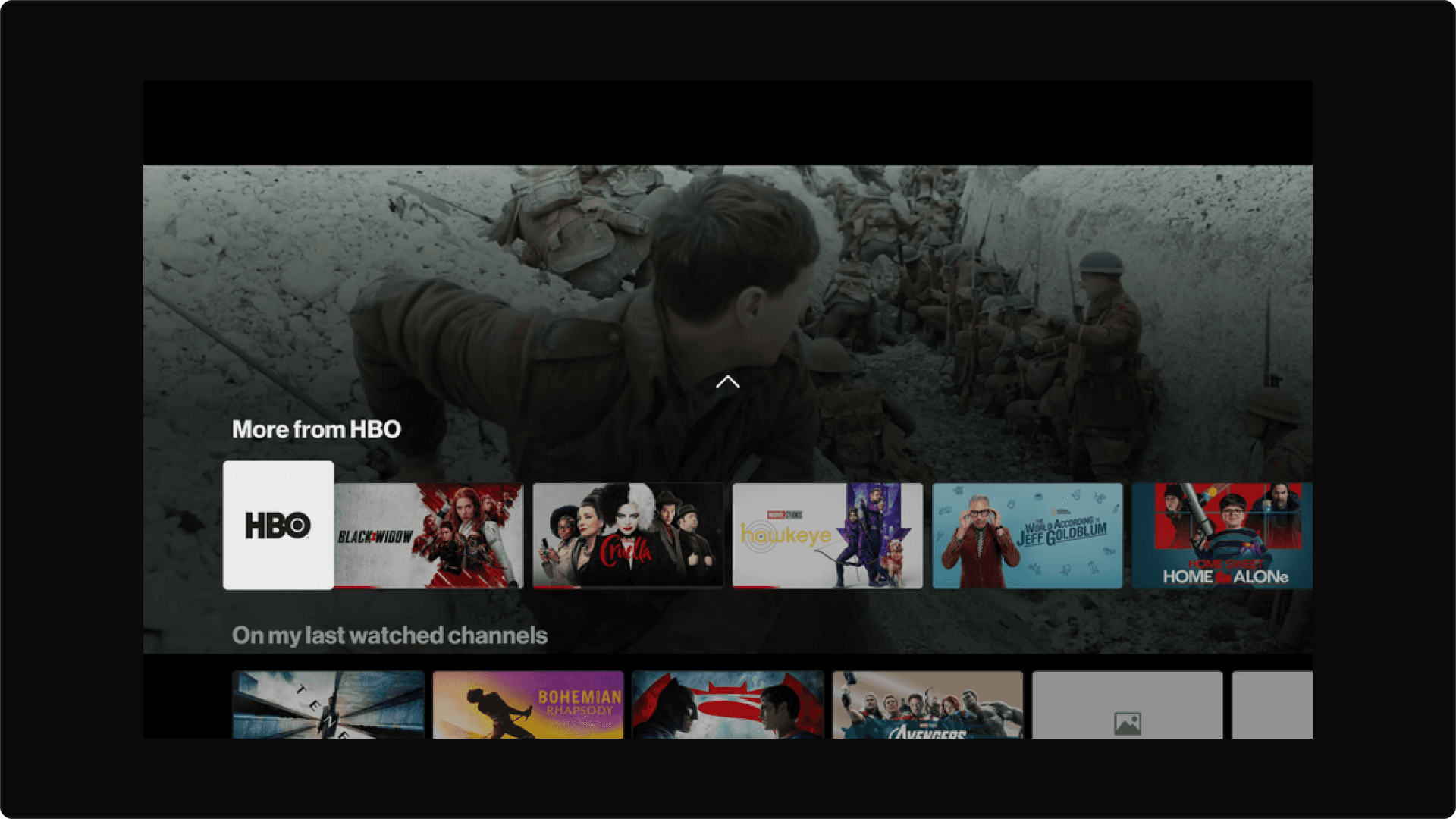
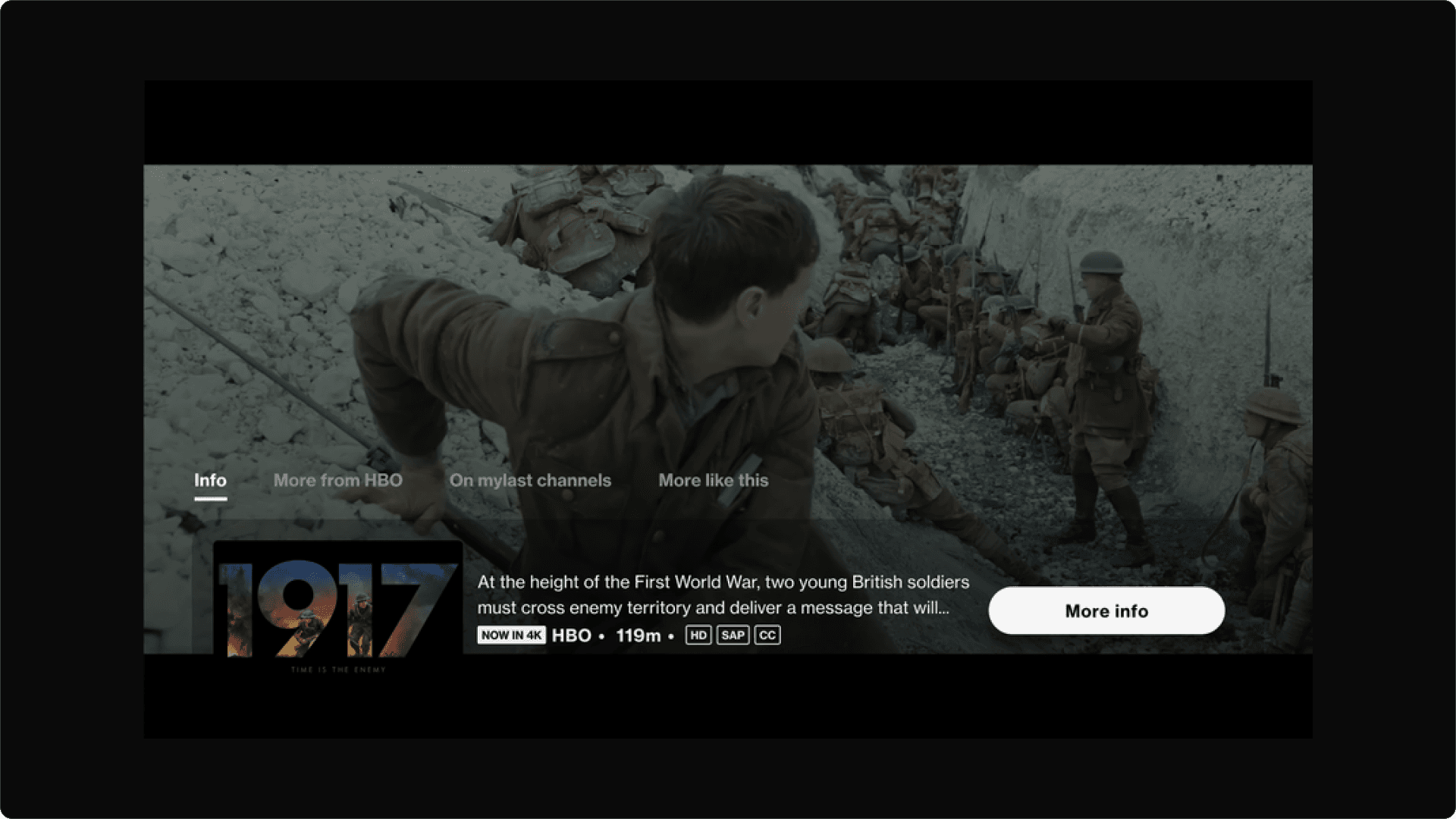
FCL consumption view with functions visible
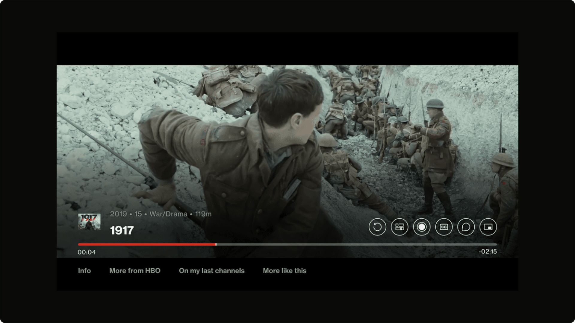
FCL consumption view with ‘Start over’ function in focus
The Why

This project was conducted to make sure all of the Fios TV products are aligned with one another across different platforms. This is also about quality control and making sure that customers no matter what product they are on are getting the same experience as each other.
Design goals
The design goals for this product was to align the Fire TV and Apple TV UI with Verizons Fios TV UI and ensure they are both up to date and function in the same way across the different platforms. One of the main goals was to reflect the iconography and functionality of the buttons that are available to a user when in consumption view on FCL.
I was able to utilise the Fire TV UI library, which wasn’t too far off from our Verizon Fios TV library. I also used the Apple TV-OS UI library which was different in terms of iconography but apart from that very similar as well.
I needed to give a Fios TV experience on a Fire TV and Apple TV platform.
The icons available on FCL are: start over, record, closed captions, audio captions and more info.
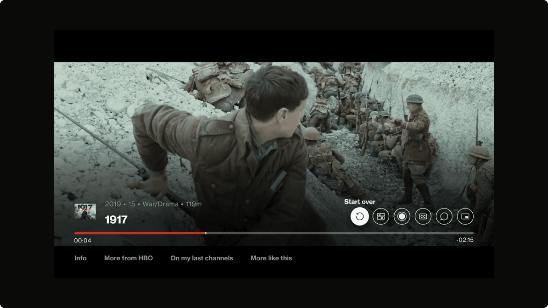
FCL Consumption view with the ‘record’ icon in focus
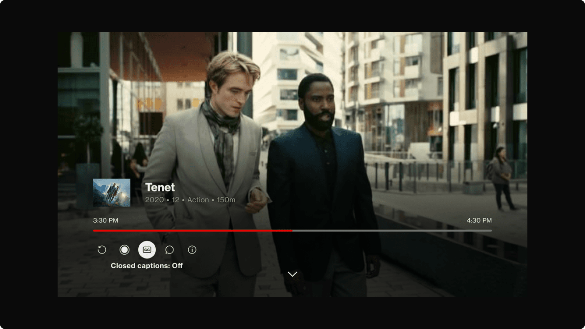
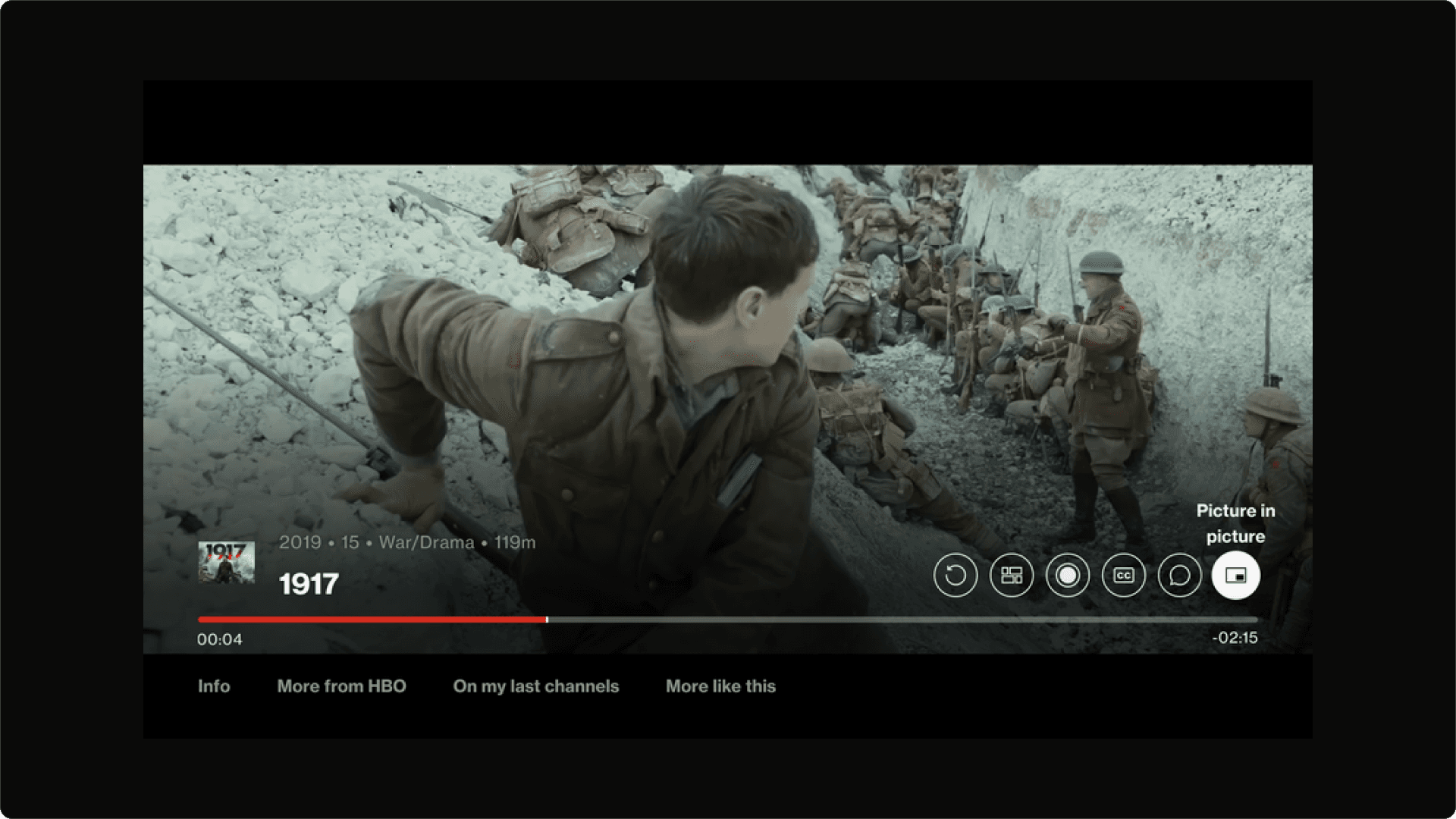
FCL Consumption view with ‘closed caption’ icon in focus
Research
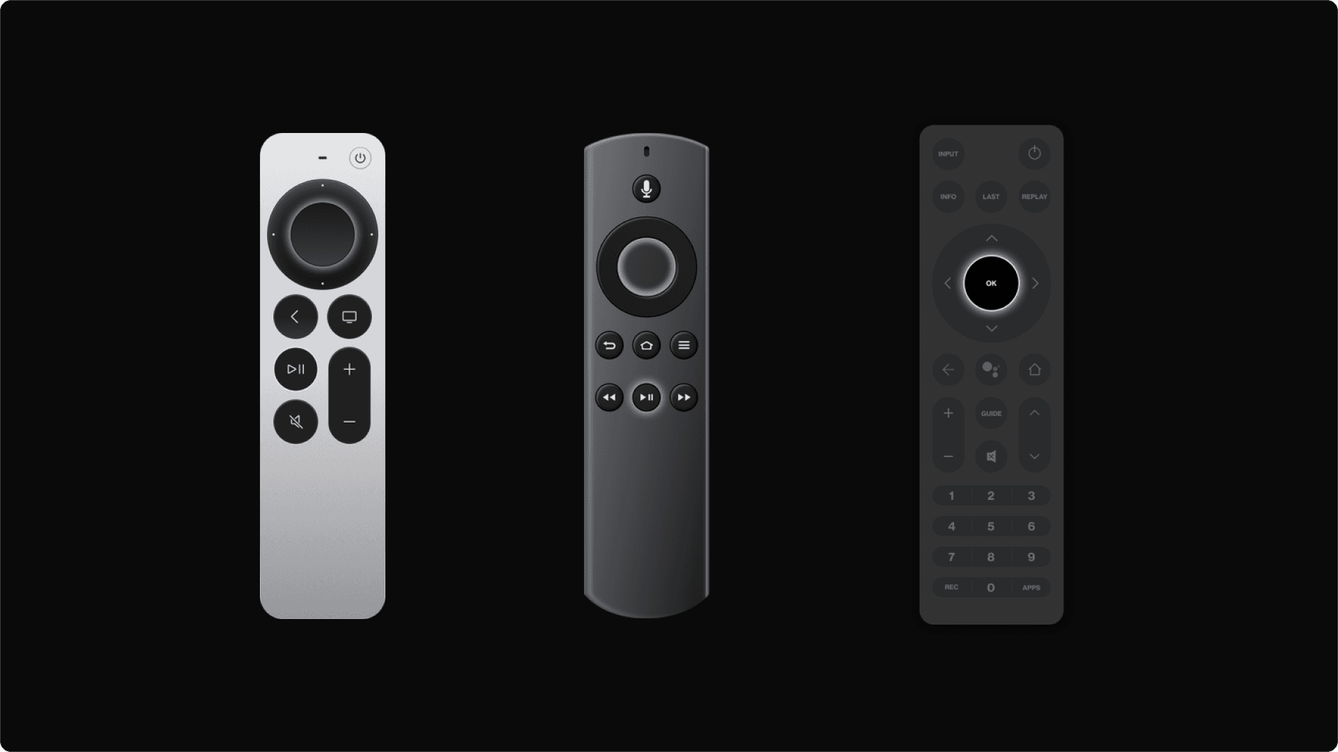
The research conducted for this project was predominantly internal. I used the updated FCL consumption view experience to base my designs off of. I also had to consider the functionality of the product because on FCL we have a remote control with a lot more buttons than on Apple TV and Fire TV. So, thinking around how the remote will be used and the limitations were definitely undertaken.
I based my designs off of the FCL UI and the functionality of the FCL remote control - what was doable and possible I included and where hiccups may have occurred I found a solution for it.
Solutions
Fire TV
The consumption views for Fire TV and Apple TV involved more icons being introduced than on FCL. This was because a user on Fire TV or Apple TV had more functionality they could do - one of the main was being Picture in Picture (PIP).
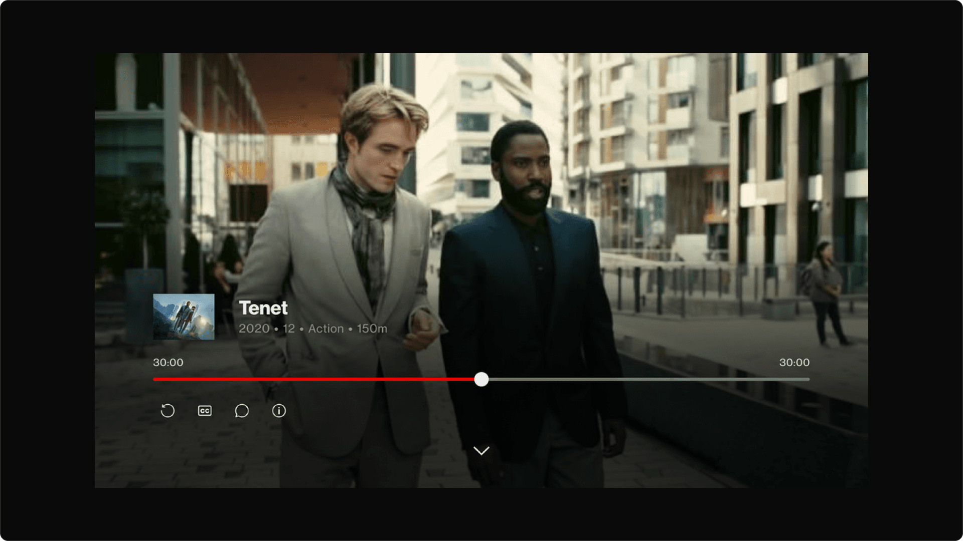
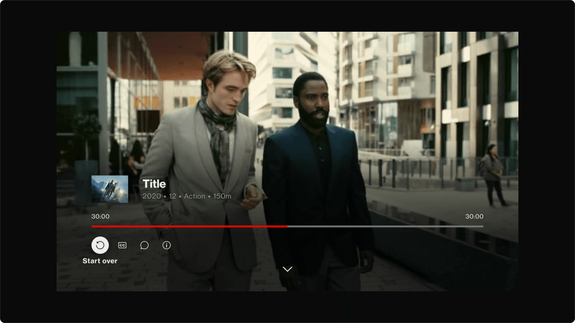
Below is the Fire TV consumption view for Fire TV. The icons that a user can function are: start over, guide, record, closed captions, audio captions, more info and picture in picture. Visually **the consumption view for Fire TV is very similar to FCL’s consumption view the main difference is the introduction of 2 more icons in the utility rail.
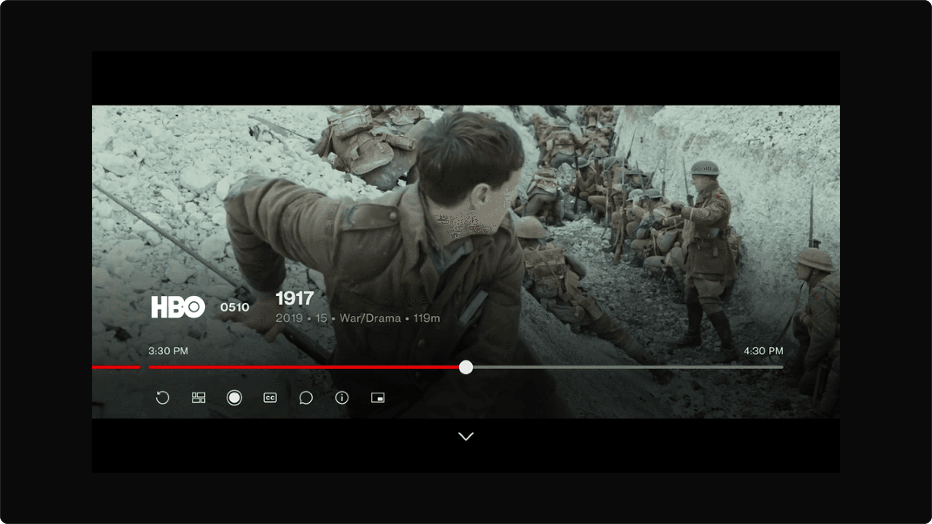
Fire TV Consumption View: Progress Bar
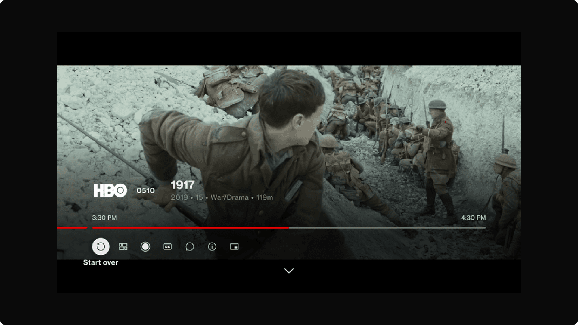
Fire TV Consumption View: Start Over
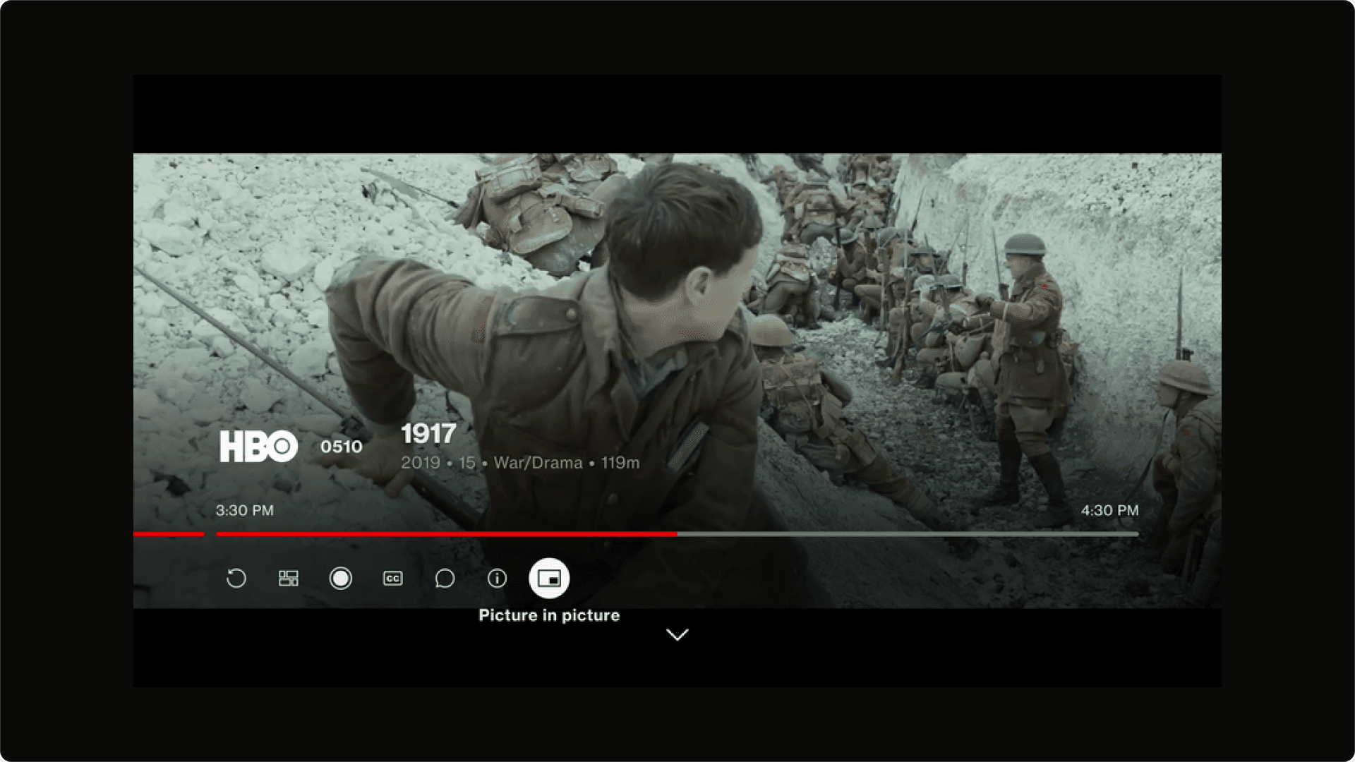
Fire TV Consumption View: Picture in Picture
Fire TV Consumption View: ‘More from’ rail
Apple TV
Below is the Apple TV consumption view for Fire TV. The icons that a user can function are: start over, guide, record, closed captions, audio captions and player in picture. The main difference with the Apple TV consumption view is the position and the look of the utility icons, the progress bar (no circle when in focus), and the tabs available to a user at the bottom of the consumption view. Where the ‘more info’ icon would have been was moved to the bottom of the consumption view because there could only be a maximum of 6 utility icons on the screen.
Apple TV Consumption View: Progress Bar
Apple TV Consumption View: Start Over
Apple TV Consumption View: Picture in Picture
Apple TV Consumption View: More Info
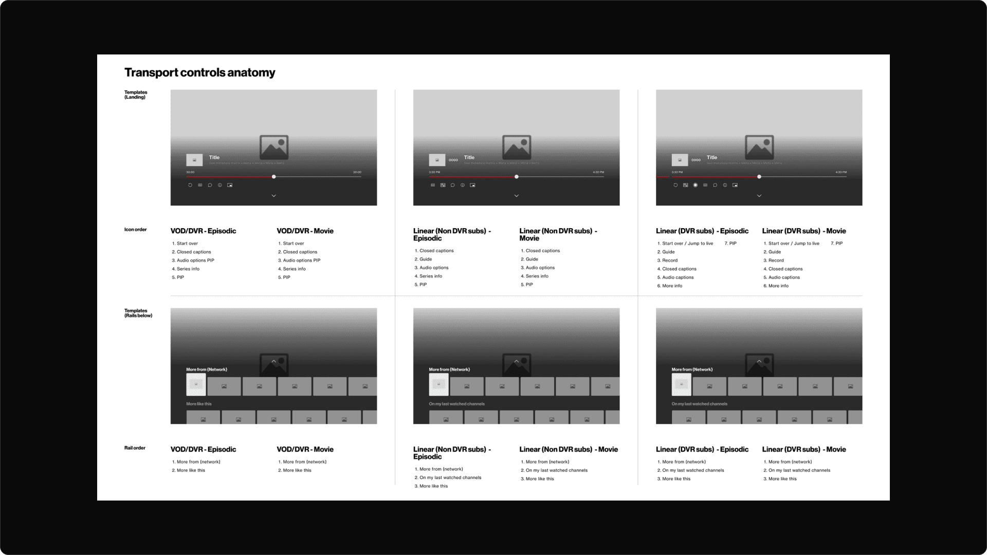
Transport controls anatomy
Takeaway
This was an interesting project for me to take charge of for a few reasons. Firstly, it involved using thinking around the specifications of 3 different products and how a user interacts with them. I had to think in a way where the same experience can be had on different products and that allowed me to tap into new ways of thinking.
Secondly, I had to think about remote functionality - this involved a physical product interacting with a digital and again 3 different remotes. Thinking around how they each act and react as crucial to the experience and the user.
Thirdly, I had to consider the UI limitations and alignment that needed to be done in order to achieve the design goals that the client wanted. I would say this was a well rounded project that brought many different though processes into one and allowed me to fuse, UX, UI and physical products all into one project.
This will hide itself!